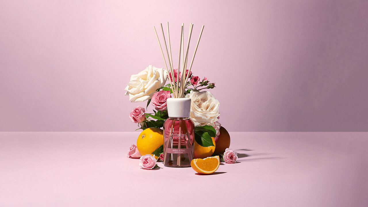
Millefiori Milano was founded in the late 1990s and has since dedicated itself to the world of home fragrances, combining Italian design with the creation of scents that turn any space into a unique sensory experience.
Millefiori Milano appeals to those who wish to add a touch of style and refinement to their environments, offering design diffusers and fragrances in an accessible price range.
Millefiori first turned to NAMA, which coordinated the project and handled content architecture, and then to us to make product discovery and the shopping experience smoother and more intuitive on their e-commerce platform.
The brief
The challenge was to transform Millefiori’s e-commerce into a coherent, fluid, and functional digital experience, fully aligned with the brand’s identity and values.
Main pain points:
In the previous Millefiori Milano e-commerce, many users bought fragrance diffusers without adding the corresponding refills, as the site’s UX didn’t make it clear that both products were required for complete use.
In other cases, customers purchased refills that were not compatible with their existing diffusers.
One of the main goals of the new e-commerce optimization project was therefore to improve the user experience and reduce purchase errors, guiding customers clearly and intuitively in choosing the right products.
First things first: rethinking structure and navigation flows
Over time, the previous site’s user experience had become fragmented, making it difficult to group products logically and create an effective filtering mechanism across the fragrance section.
Our first step was to map the existing website pages, identifying which sections were truly necessary and which could be merged or simplified.
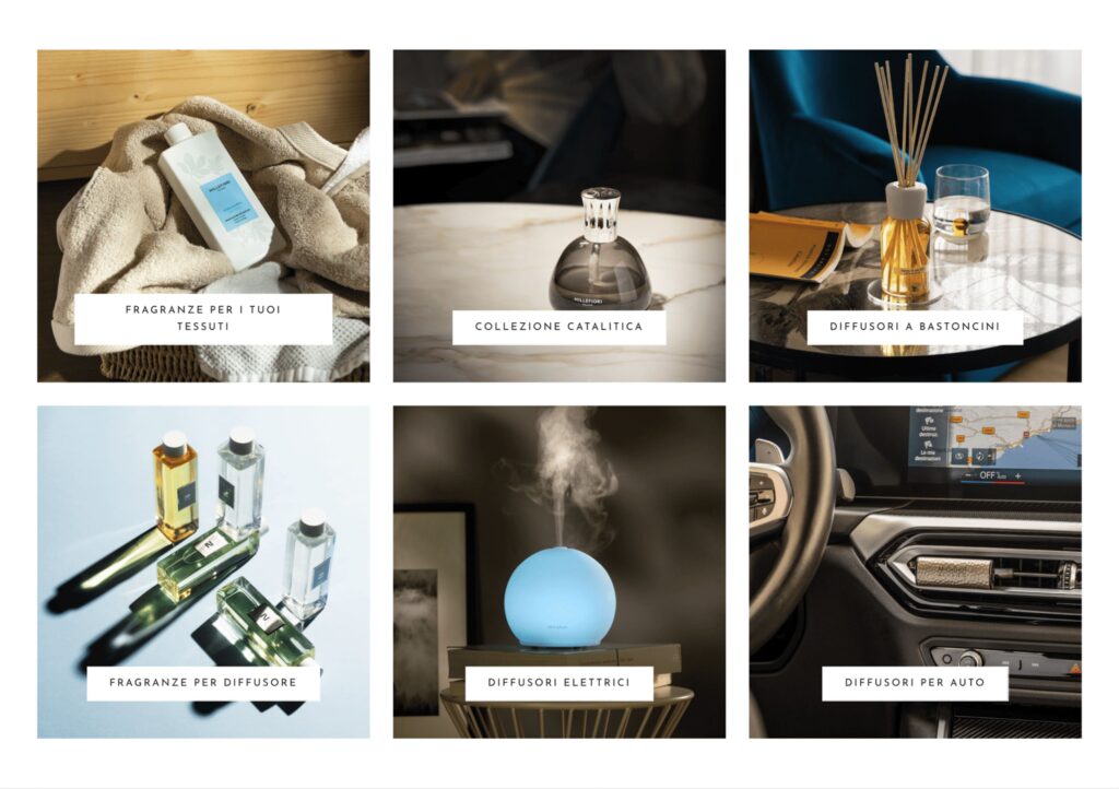
In menu of the previous website, products and refills were separated, making it unclear that the two collections were related. There was also an additional “Lines” menu item containing the same products grouped by Line, which created redundancies and confusion: users didn’t know where to find what they were looking for. The overall structure had become unnecessarily complex due to years of layering and adjustments.
When designing the new site map, our goal was to simplify navigation and make product discovery immediate.
The new main menu now features a “Products” section that opens a comprehensive panel with all available categories, immediately visible and accessible.
From there, users can locate the desired items using a global filtering mechanism, allowing them to find products from any category page quickly and consistently, ensuring a smoother browsing experience.
This structural overhaul helps users orient themselves from the very first navigation level.
From visual concept to system
Next, we analyzed the brand’s visual language — characterized by two primary typefaces (MTT Milano and Lora), a minimal black-and-white palette, and an elegant tone expressed mainly through product and mood photography.
Our goal was to translate these visual elements into a cohesive interface system, preserving Millefiori’s refined personality in the digital ecosystem.
We applied MTT Milano to the site’s main UI elements and reserved Lora for body text.
Thanks to a well-structured existing brandbook, adapting the brand identity to e-commerce was a natural and straightforward process.
Based on these guidelines, we built a design system in Figma tailored for e-commerce development, the design system has the following features:
- A defined, minimal color palette — only black and white — allowing the colorful fragrances and products to stand out while maintaining visual contrast and accessibility.
- Consistent typography with clear hierarchy, readable on every device.
- Spacious layouts and grid systems designed to give content breathing room and highlight product photography.
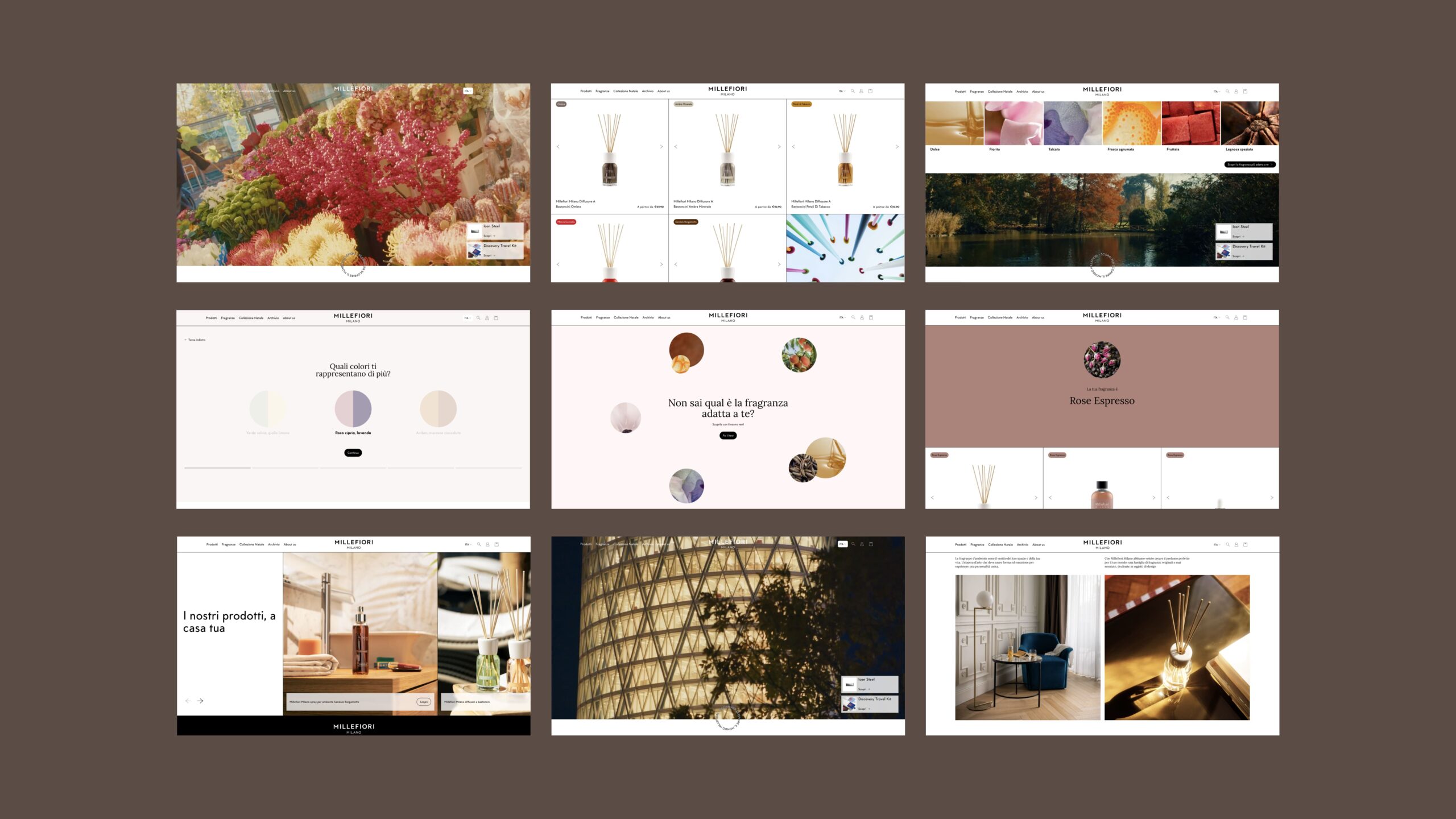
The category page UI alternates between product images and mood shots, conveying the emotional and sensorial spirit of Millefiori fragrances.
Translating the brand into Shopify’s language
In the new Millefiori website, every element reflects the brand’s signature care and harmony.
We designed a digital experience where aesthetics and usability coexist, creating a coherent, recognizable, and intuitive journey that guides users seamlessly from first impression to checkout.
Millefiori’s brand is deeply tied to fragrance families, each associated with its own color palette — one color per scent.
We focused on bringing fragrances back to the center of navigation by:
- Displaying fragrance labels and their colors directly on each product card;
- Making fragrance families immediately visible in the menu, leading to category pages where filtering products by scent is simple and intuitive;
- Grouping fragrances by color category rather than listing them individually (there are about 50), ensuring a smoother and more visually guided browsing experience.
This color-based organization helps users easily select fragrances that best match their home décor and ambiance.
The e-commerce was developed on Horizon, Shopify’s new boilerplate theme.
We built a Figma file incorporating all Horizon blocks, while allowing ourselves the flexibility to design custom UX patterns based on our findings.

How we solved the main pain points and UX issues
Product gallery box
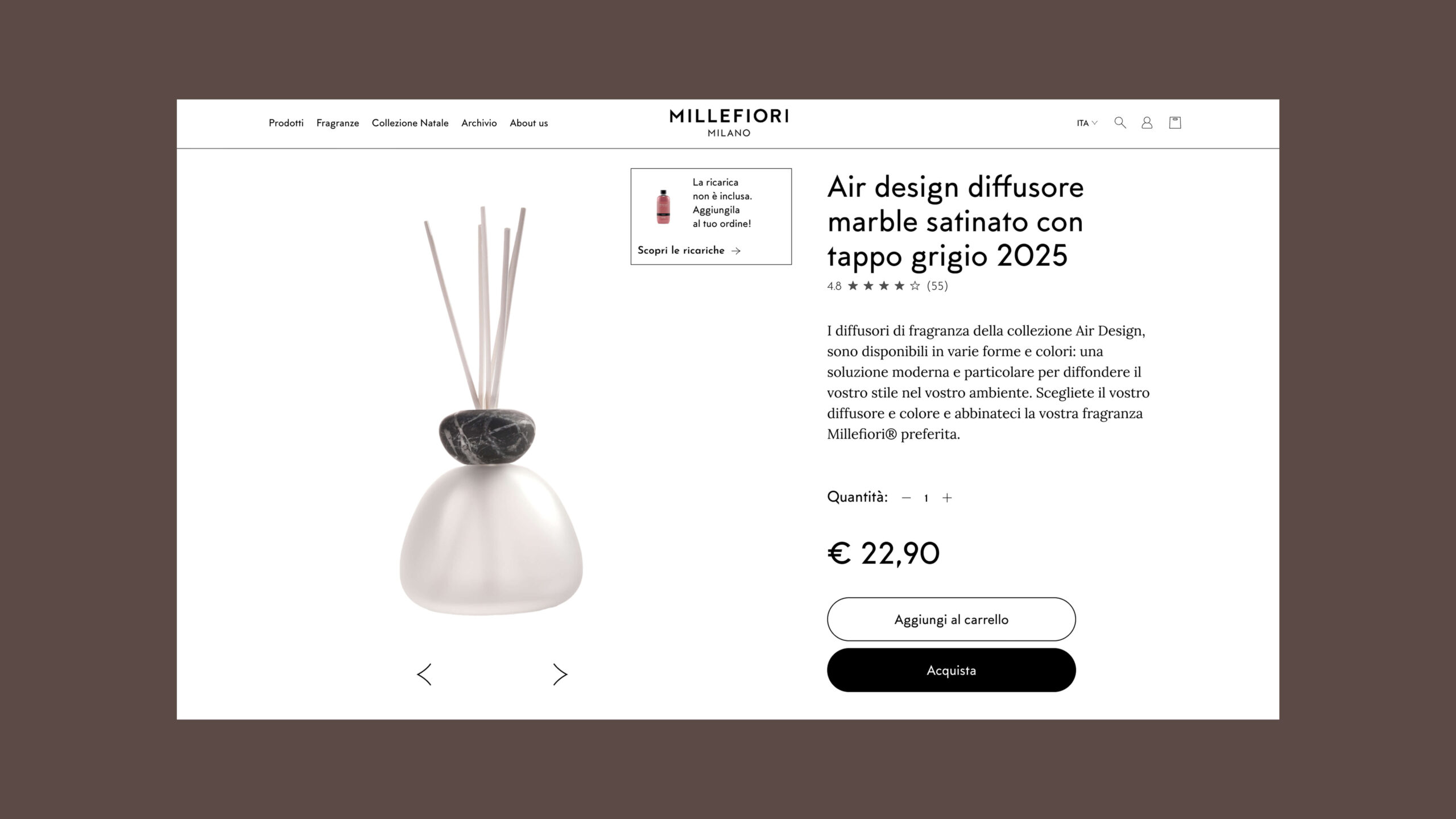
One key issue was that users often didn’t realize they needed both the diffuser and the refill.
To clarify this, we added a small box in the top-right corner of the product gallery, clearly stating when the refill is not included and linking directly to the corresponding refill product page — so users can add it to their cart immediately.
Related products
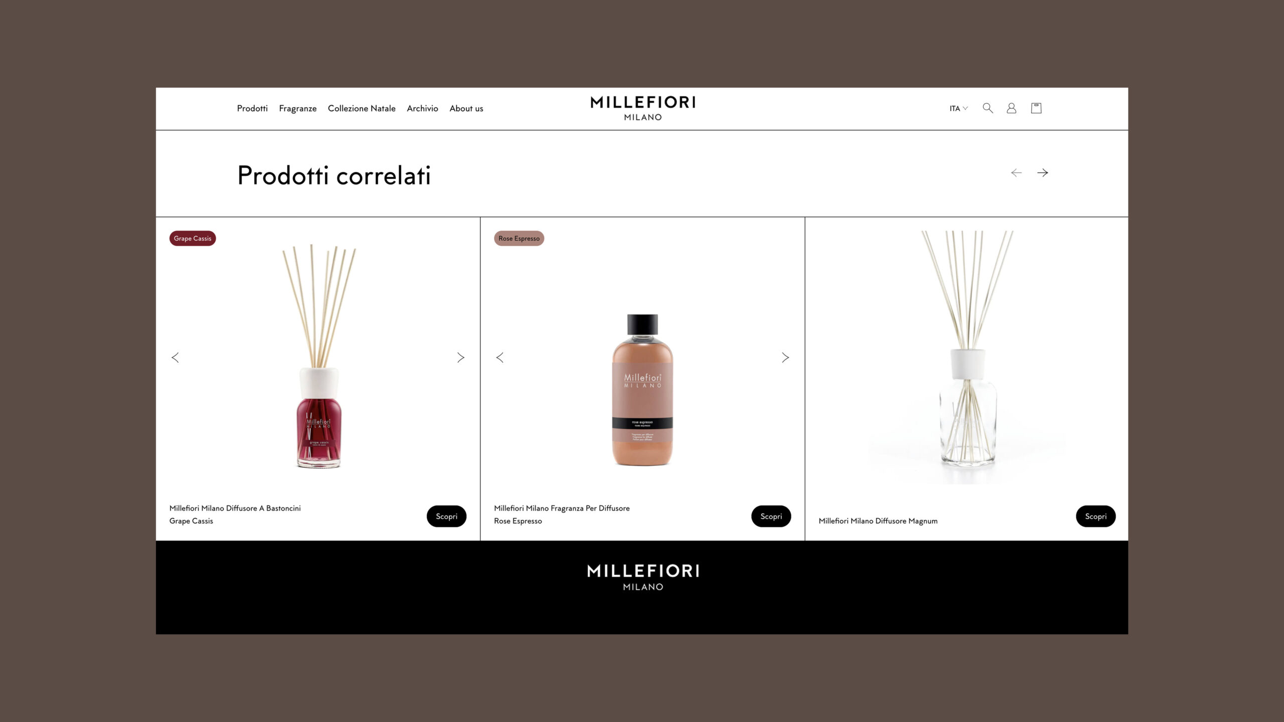
Another recurring issue was identifying the correct refill for each diffuser.
We addressed this by showing the corresponding refill directly in the “Related products” section of each product page, reducing confusion and minimizing purchase errors.
The Fragrance finder
One of the most engaging features we developed is the Fragrance finder — a quiz designed to help users discover the fragrance that best matches their preferences.
The quiz consists of five multiple-choice questions and suggests the ideal product based on user responses.
Millefiori’s team can easily update the content, create new quizzes, and link different fragrances — for example, during seasonal campaigns or holidays — to offer a fresh and personalized experience.
The system connects directly to Shopify collections, organizing products by type, line, or occasion.
This allows each quiz result to dynamically link to the relevant collection, making navigation seamless and purchase recommendations more meaningful and aligned with user tastes.
Working on Millefiori Milano was a truly inspiring experience.
We had the opportunity to translate a refined and well-defined visual identity into a digital language that preserves the brand’s sensorial and emotional essence online.
It was a collaborative effort, where ongoing dialogue and teamwork with Millefiori and NAMA allowed us to find the perfect balance between aesthetics and functionality and create a digital experience that feels unmistakably Millefiori.

