The Catella Foundation turned 20, and it was the perfect opportunity to rethink the website structure and design. The goal was to improve user experience and make the website a more accurate representation of the Foundation’s activities. The previous site had grown through multiple layers of updates over the years, resulting in a complex and unintuitive user experience.
Project goals
The redesign was guided by two main objectives:
- strengthening the Foundation’s digital presence, making it clearer and more recognizable;
- creating a digital space where institutional content meets narrative storytelling, to better engage citizens and convey the Foundation’s impact on the city of Milan.
A renewed visual and value-driven narrative
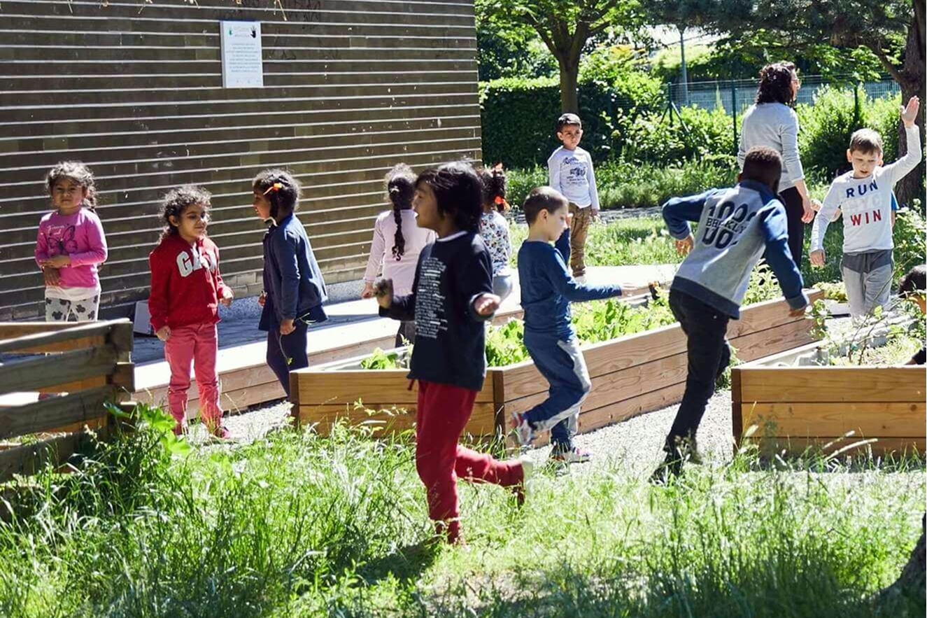
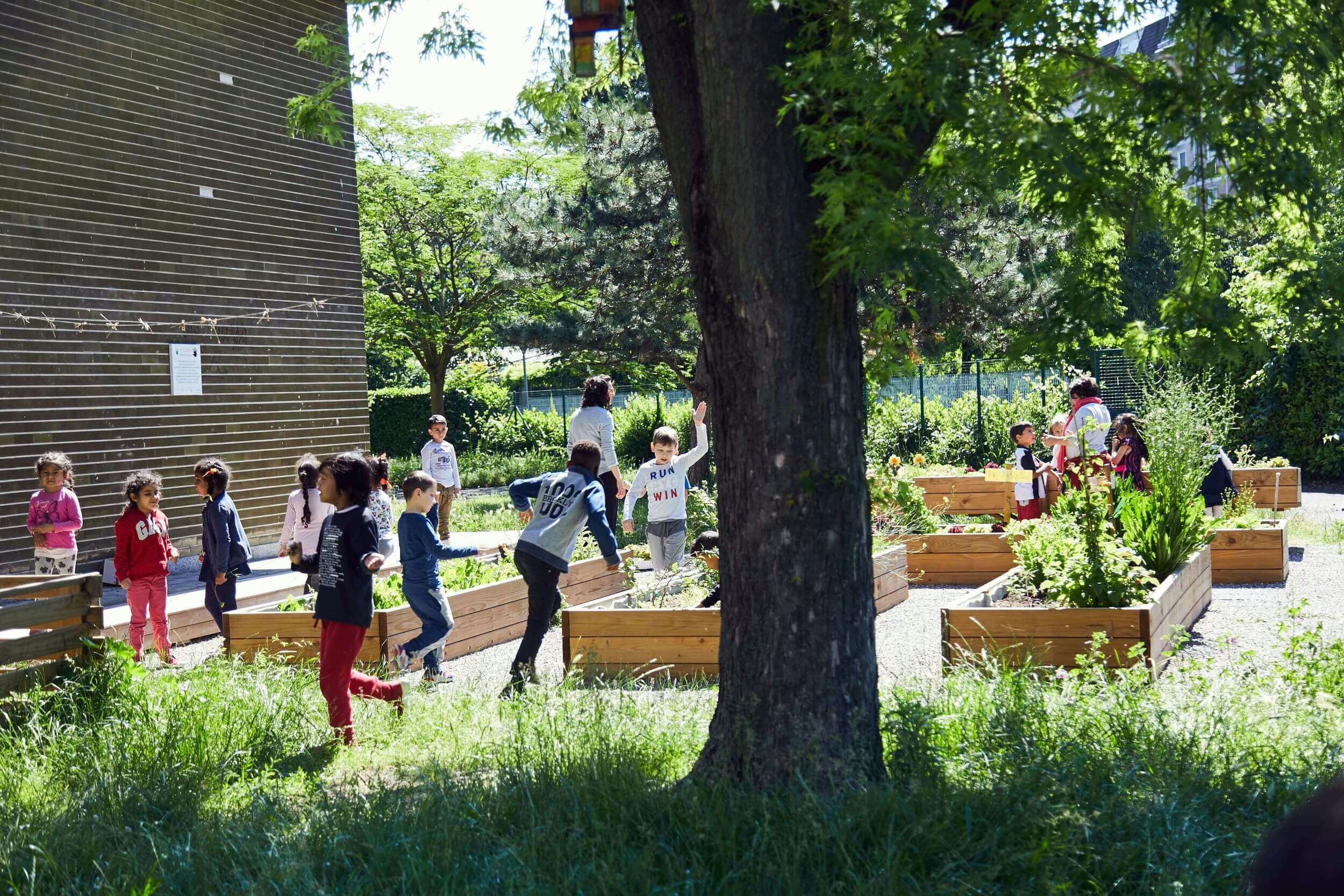
We began by focusing on the Foundation’s motto, “Partecipare è condividere” (Participating means sharing), which we placed at the core of the user experience. It is the first element visible upon entering the site, accompanied by images from participatory projects. Directly below, we introduced the three core values — Sharing, Inclusion, and Collaboration — which guide the Foundation’s work.
Our intention was to communicate through storytelling rather than purely informational content. For this reason, the homepage integrates text, keywords, and evocative imagery to create a visual narrative aligned with the Foundation’s mission and its connection to the Porta Nuova district.
Digital presence and the non-profit sector
A key challenge was to preserve an institutional tone while also reflecting the Foundation’s human-centered approach.
A clear language, readable structure, and strong visual coherence increase transparency and help reduce any perceived distance between the organization and its audience.
In the non-profit world, these elements are essential as they communicate reliability, professionalism, and care.
Building a digital presence coherent with the brand identity
The design process was grounded in the FRC Identity Guidelines, which define an institutional visual system based on:
- a refined and rebalanced logo,
- a palette of blues,
- the use of Arnhem as the main typeface.
To improve on-screen readability, we paired Arnhem with Manrope, an open-source sans serif font with clean shapes ideal for long-form digital content and interfaces.
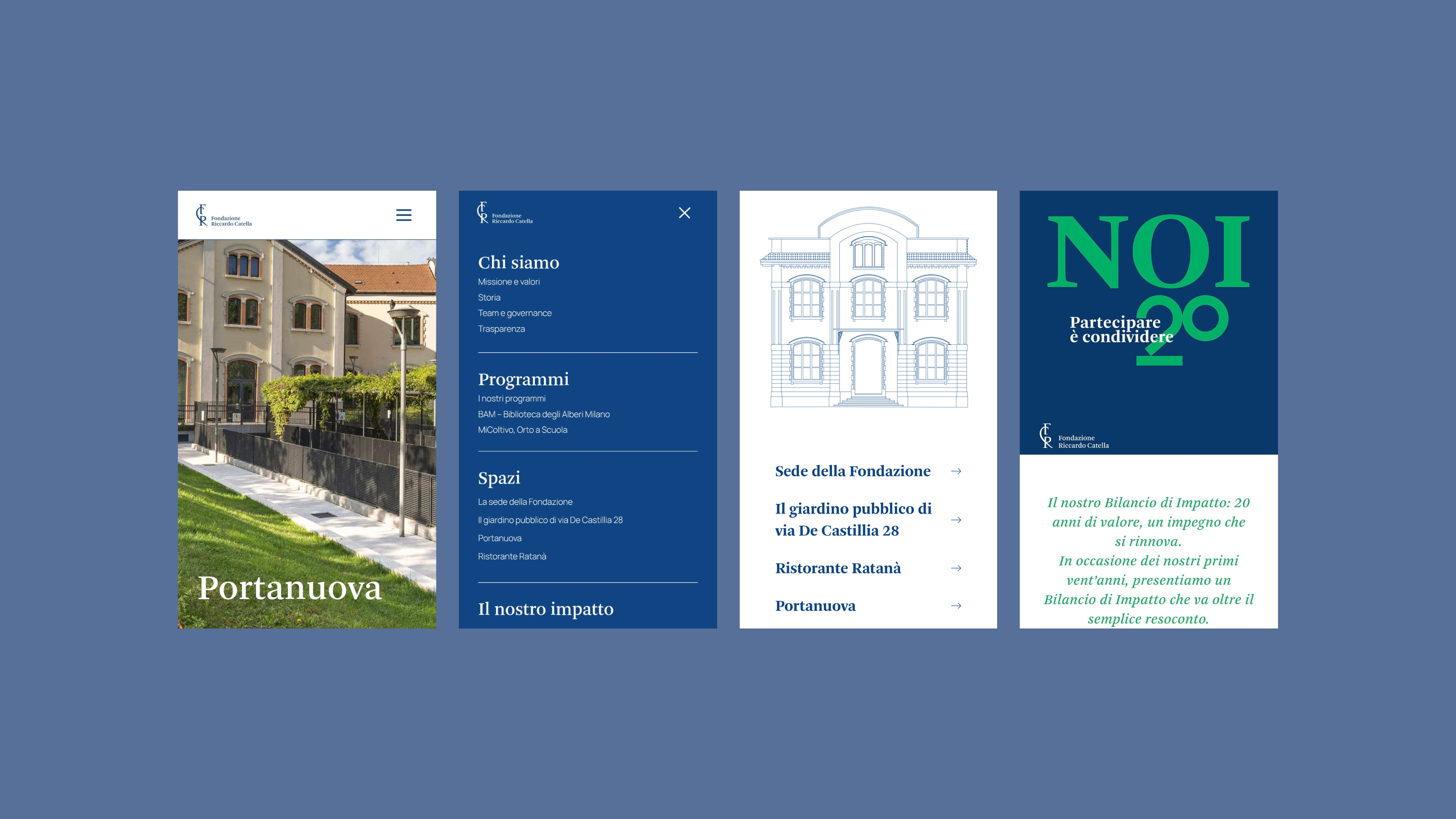
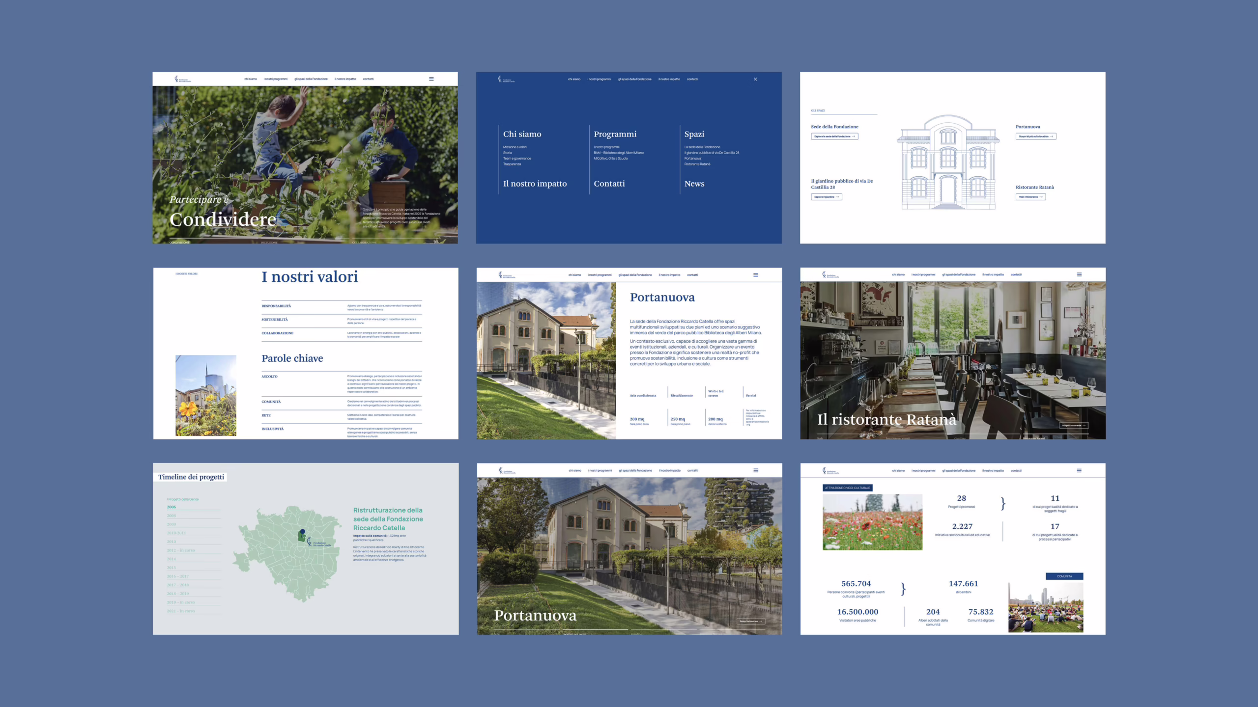
How we simplified the user experience
The “Foundation Spaces” section
One of the most important sections is dedicated to the Foundation’s spaces. We chose to give images a central role in introducing each location. Every space has its own dedicated page, easily accessible through clear call-to-action buttons.
An example is the Foundation’s headquarters, a multifunctional venue overlooking the Biblioteca degli Alberi Milano park.
Since this space can be rented for events, we made sure that technical specifications — essential for event planning — were immediately visible.
Programs
Another key goal was to help the Foundation build an online presence not exclusively associated with BAM — its most well-known project — but reflective of the diversity of its initiatives.
We restructured the Programs section to better highlight the Foundation’s broader work in urban regeneration, culture, and civic engagement.
20-year Anniversary
For the page dedicated to the Foundation’s 20-year impact, we collaborated with Avanzi, who curated the content and produced the report.
Our role was to provide visual and structural guidelines, ensuring that the anniversary identity translated seamlessly into a page consistent with the overall design system.
Making content management easy with our WordPress framework North
To ensure the Foundation could manage the site independently, we developed it using North, our proprietary modular WordPress framework.
North is based on block components — like LEGO pieces — including paragraphs, titles, images, videos, galleries, and more. These blocks can be combined freely to build pages and layouts in a fast and consistent way. We recreated the whole WordPress block system with Tailwind-based, fully accessible react blocks.
Key advantages:
- content can be reorganized without technical intervention;
- the backend mirrors the frontend, offering a highly intuitive editing experience;
- real-time preview ensures full control over the final output.
This system allows the Foundation’s team to update the site autonomously while preserving coherence and quality over time.
Redesigning the Riccardo Catella Foundation website was a particularly meaningful experience: it allowed us to translate the Foundation’s values and cultural identity into a digital language that is clear, accessible, and capable of expressing its vision authentically.
It was a collaborative project in which continuous dialogue with the Foundation’s team and with Avanzi enabled us to strike the right balance between informational rigor, visual sensitivity, and a smooth, engaging browsing experience.