Let’s face it, our previous humorous website worked out pretty good.
It was a work of tasteful copyrighting, instead of the usual sheer muscular dev technique and spinning thingamajigs; just two hours of code + irony turned out into a +25% higher turnover in just one year. Not bad at all for a landing page.
But no matter how funny and unconventional it happened to be, it just couldn’t last forever: even the most beautiful jokes, repeated a hundred times, soon become boring and worn out.
Context
2020 and 2021 have seen us growing, in aggregate, by 40% in turnover and by 60% in personnel. Our new customers no longer look at all like our old ones: our tone of voice, a little reluctantly, had to change — it’s okay to be funny and unconventional, but it’s easy to be confused with being a fully-fledged loon by those who simply don’t know you and your sense of humour. In fact, those who’ve already had the chance to work with us know how committed, serious and accurate we are. It’s not all about jokes.
The first sprout of the new site emerged during the hardest days of the first pandemic wave: job requests multiplied — especially e-commerce — but potential customers reacted with a smirk when our partners sent them over the link to our website: “ok, that’s funny-ha-ha, but it doesn’t looks like a serious agency, are they?” was the average reaction.
Our “official” site was by now cringe material, looking like a thermo-hydraulic engineering firm. Kinda aged pretty badly.
On March 10, 2021, OVH hands me over my birthday present one day in advance: most of our customers’ servers burn down in a gigantic arson event in their Strasbourg data center, including our own website and server. Candles were enough, guys, there was no need to go big. I took this as a sign: procrastination time is over.
April 2021
By the end of April, in one of the first post-pandemic “in-person” meetings in the office, I meet with Elena, our art director, and Matteo, our most skilled frontend, to share my ideas. Two weeks later Elena returns to the lab with a very nice and modern looking layout, a flamboyant typography dancing with curtains.js in the usual WordPress + Barba.js plexus: i’m not satisfied though. As beautiful and modern as it was, it’s not the right direction. Heck, it’s not their fault.
The naked truth: it’s our fault. A beautiful website surely needs nice copy, beautiful images, beautiful videos too. Do we have any? No way José. Not a single frame.
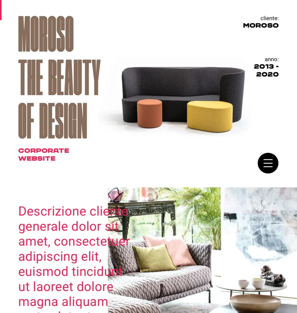
Like most dev agencies, we kinda cheat: we base our entire looks out of our customers’ creativity: yet we are not Moroso sofas, nor the BAM park. Indeed what we could display of our work would be quite dull for the non-nerd public.
I grumble and mumble, until I realize that animation, user interaction and user experience are probably the only parts of our work that are immediately clear to the general public. Videos of our sites, in a nutshell, not jpgs. And I hardly saw this anywhere: awkward, right? Just big colorful ambitious jpgs, a few funny gifs, that’s enough. Video. I scribble down on a note.
May 2021
Meanwhile, I begin to nail down what I DO NOT want on our site.
- most mobile sites suck big time. The mobile version of very popular, award-winning desktop sites is a messy, endless strip of chaotic, unreadable content. Doomscrolling material.
Not responsive yet “squidgy”; meaningful stuff crammed into tiny space, while the computer CPU blows like a sick dragon and runs the mobile phone as with the torch on, consuming the equivalent of a pre-war Soviet power plant to animate photographs for a sheer quirk. Our beloved WWW, folks, consumes a lot of energy, and therefore pollutes. - Customer Names: I keep thinking about it, front page “logo wall” names make me sick. It’s a very, very easy way to declare your pedigree, sure, but it looks to me like someone wanting to qualify as a partner, sends you pictures of other lovers they had before you.
I’m kidding, of course, yet you’ll probably agree a little bit with me. If client names have to be there, it really has to be meaningful for the explanation of a super nice project — they don’t have to look like stuffed hunting trophies hung on the wall. It makes perfect sense only if you solve someone’s problem in your own productive context and exemplify it. - We will NOT have the terrible “staff page with funny photos” on the agency website. Maybe with excessive severity I call it “the obituary page”: staff forced into reluctant grins, maybe hating each other guts.
If there really really really has to be our such pictures on the site, let’s not do it like that. - Texts, texts, texts: all sites have intimidating oceans of text. Motivational text. Pseudo-newage-babble-text. Slogans nobody really asked for. I want to check the way you and your team work, you answer me back with poems about moths. I ask you what services you might be providing and you answer back with a quote from Pepe Mujica.
I can easily picture myself standing in the middle of my flooded house, calling the plumber and he answers me back with a haiku. Maybe it’s one of the reasons we are looking more and more for answers and relevant information in chats and social networks. THIS THING IS LEADING ME SOMEWHERE. WRITE IT DOWN.
June 2021
I ask Matteo to try to simulate a chat system. The idea is to have some kind of chatbot. Matteo writes from scratch a mini javascript framework that seems to work pretty well too, with multiple answers to the same questions. I play with it for a couple of weeks: technically beautiful as it may be, turns out to be a dramatically cold answering-machine experience. I can imagine a user eager to understand what we do in a few clicks and forced to spend 15 minutes fighting his way around my poor humor crammed into boring bubbles before landing into a proper search result. People gets bored fast. The idea of the chatbot in itself is not bad, but it must be simplified, contextualized. Elena’s-infinite-patience finds a similar reference but its style is definitely too brutalist for my likes.
My co-founder Giulio looks puzzled, yet he remembers his intention to make a dev game, a game where you play as a web developer. As a good egotist, I raise the bar: not just the game of managing a freelancer, but an entire agency. The perfect example is Toggl’s Unicorn Startup Simulator.
I stare at its interface, its page placement, and I ruminate, and ruminate.
Are we bold enough to try such a provocation? A mobile only site?
July 2021
We trial the reduced form and it makes the chat look pretty neat and more polished, but when the desktop modals widen to full screen the result is messy. When we try to put a fullscreen video as a background to the chat the result is even more dramatic. It turns into a site crammed with our customer’s creativity and interfaces underneath. As much as we try to make a minimal interface, all of our icons seems to overlap with our customers’ graphics, who obviously do not speak to each other.
Nope, nope, nope.
We throw away the fullscreen video. Olè.
And a text-only version of the interface = horrible boredom. I am the one who conceived it, i should be super excited about it. Nope. It is dull and boring.
I warn Matteo we will have to simplify the chat: it’s a pity, his code is brilliant. It’s a major downgrade: he reminds me that it will take him a day just to “clean up” the code a bit. He will be forced to go into cleansing routines many more times.
Visuals are still large fields of white with background dots. Engineering stuff again. No good. The more I remove, the more I feel like taking stuff out. Elena looks puzzled at this mess, torn between telling me “it doesn’t work” or “it doesn’t work”.
September 2021
Emojis are part of our cultural landscape for at least the last two decades. And so do icons. Using standard icons? Meh. I’d rather not use smileys and messenger-like icons, nuh-uh.
I recall a trip to Berlin, visiting the Humboldt-box Museum, whose wall were decorated with pictograms that looked like cavemen paintings. That looked so cool. Something that even a primitive man could easily recognize and find familiar, non-verbally. This is exactly my point when I involve Luca Malisan in the project: I have known Luca for years, since I was a thin graphic designer and he was a chubby programmer — now both roles and weights have reversed. Luca is an illustrator with a stunning portfolio (Dragonero, Bonelli, Glenàt and a thousand more) and a spectacular 3D designer too: we recently encouraged him to work in three.js. But here we don’t need three.js — it weighs too much, in terms of sheer performance and too much for just an icon.
The scroll in the first screen is too short, so we can’t use GSAP’s Scrolltrigger to activate icons when we scroll: we decide that — on mobile — the animation will run every few seconds despite the action. Yes, they look like I wanted them to look.
Texts take shape. They don’t have the disruptive humor of our old landing page but they are still trés Ensoul. We limit each video to 30 seconds and give people time to read. We put put a progress bar that looks like Instagram stories. It is a very popular User Interface model, why not after all.
Unlike Instagram, however, we leave them on the bottom, easier to click with one hand only.
Below we replicated the movable hamburger menu that we already made on Ghiti, but the more I look the more it seems to me to not be a very bold choice — like “hey look, I did a cool and innovative navigation BUT now I’m back to the ugly I know”. I tell the developers to remove it. [developer complaint intensifies]
Doubt spreads among the troops: “Fulvio no longer knows where he is going, he is spinning in circles”. It’s not true, but it’s not entirely false either: they are concerned for the company’s good and I know they are worried for a good reason, because they would like to see an end to this project. But this time it’s make or break; I can’t be satisfied with the usual tepid soup: I have to play with it, I have to make mistakes. We will lose whatever money we will lose.
October 2021
The videos: oh well, it’s where the shoe pinches, Romanin thinks. I am concerned but i don’t let my concern leak among the troops. We’ve been working for months on this site, we’ve come this far writing tens of thousands of lines of code, and we’re still in the middle of nowhere when it comes to the most important part of our content. I ask a couple of customers to send me their video reels but they seem dramatically borrowed, like the pictures you purchase with the frame.
I finally decide that the videos will be animations from our works. Luckily, we’re pretty good at animations and it’s easy to find out relevant material. The problem is finding out the best way to capture it — we have to understand how to have a smooth scroll, avoiding the feeling that the screen is being dragged by a tractor.
Luckily Matteo has a top hat overflowing with rabbits and invents this code snippet I gladly share with you.
var gsapScript = document.createElement(‘script’);
gsapScript.type = ‘text/javascript’;
gsapScript.src = ‘https://cdn.jsdelivr.net/combine/npm/gsap@3.7.1,npm/gsap@3.8.0/dist/ScrollToPlugin.min.js’;
gsapScript.onload = () => {
gsap.to(window, { scrollTo: { y: document.body.offsetHeight }, duration: 15, delay: 2, ease: ‘linear’ })
}
document.head.appendChild(gsapScript);
These few lines of code, pasted into the Chrome console, scroll the screen with a constant motion (and adjustable speed).
I spend two days straight recording and cutting videos.
Sure, videos: but how? Choices, choices.
Fullscreen, no way. Heavy, chunky, it would be needed in two formats at least.
Horizontal videos = very small on mobile.
Vertical videos = intrusive on desktop.
Square: square is a good choice. Tall enough to be readable on mobile, and taking only half the screen only in desktop, while the chat is still centered. It’s a good compromise: we add some shadow to the chat bubbles which definitely makes them definitely pop out. We do some testing by dragging the progress bars around, yet we decide to leave it in the middle, so that it minimizes the junction between the video and the text on its side.
We find a fallback: video will always be square — if the monitor is really big, video will still be square.
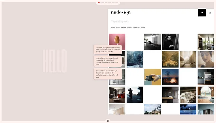
We also start working on the gestures: tap to stop the scroll, swipe to proceed to the next video. Mobile-wise it definitely feels great.
I’m starting to think that yeah, so far so good, but there has to be an English version too. Ok, I ask Matteo to implement a second language [developer grumble intensifies] and I translate the text. But where do I put the language switch now? *sigh*
November 2021
It is November 5 and I am at the états généraux of the Friulian language. I am are there because Ensoul has ARLeF, the regional agency for the Friulian language, among its customers and has worked on the beautiful Ghiti project to encourage bilingualism in children. We are strong believers in creating context to bring the Friulian language more and more into information technologies and we —
-I find facepalming myself in the middle of the convention: sure, that’s so considerate to translate your site in English, Romanin, but at this point, why not also Friulian?
I ask my old musical comrade Ferdinando Passone, former Passion of DLH posse, MC in my old hip hop band to translate all the text — the game alone is 1400 lines of translation —into a Friulian that’s more decent than mine.
Two problems start to emerge: the full-white colors are no good and the icons are beautiful but they lack something, but most of all the absence of a place to put the language selector is pretty serious. Adding it at this point is almost impossible. We need some sort of splash page, we need at least an image there. The dog chases its own tail: we don’t have an ad hoc image to put there.
Code must be cleaned again, colors are missing, the picture is missing; I’m starting to think too that this site will never come to life. And I wanted to publish it before Christmas. Sheesh.
The deus ex machina thunders from Olympus and his name is Francesco Marongiu. I have known Francesco by fame for a decade, but I have never had the opportunity to work with him. He is a highly-rated fashion photographer — he has created the new image of Inter with Nike, so to speak, together with those beautiful people of The Solo House, and when I tell him, not without a hint of melancholy, where we are knee-deep in the creativemud, I distinctly hear a noise of jet turbine starting. Over the years I have had the pleasure of working with many nationally and internationally renowned professionals, but this it is the first time that I am literally overwhelmed by the sheer amount of ideas and suggestions he sends me: for the first time in my life I have to say “no, wait, less, let me think about it, I have to digest everything you sent me”. Among the dozens of inputs he sends me, one sparks a light in my head:
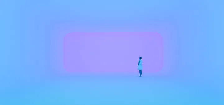
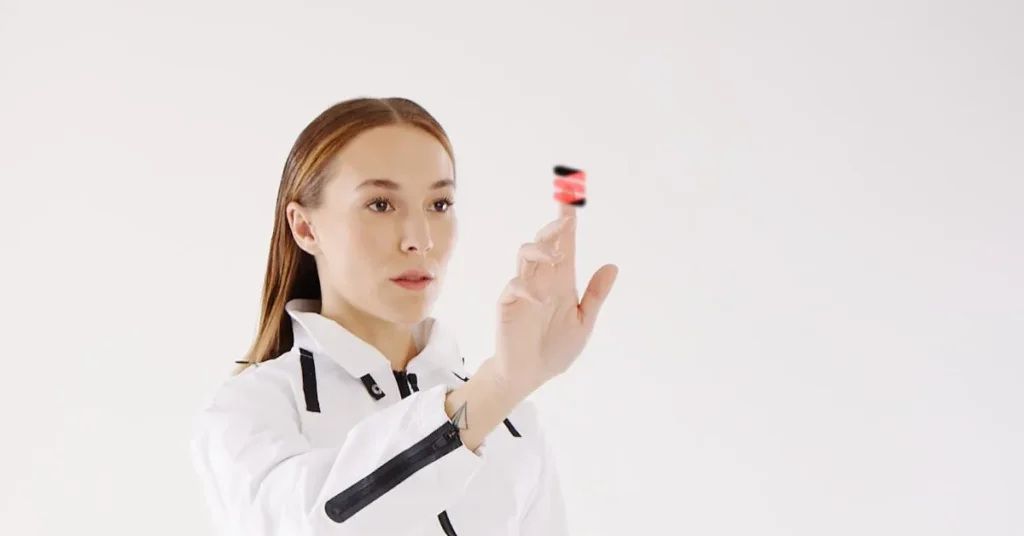
it’s a beautiful reference by James Turrell. My head flips the “screen” in the background into the shape of our smartphone. An huge CLICK! writing comes out of my head in 96-point bold Bodoni. Here’s the catch!
I start to work on colors, and pink appears, and I am the one to choose it: years ago, if you had told me that my corporate website would have been pink, I would have laughed so hard. But it’s 2021 (pretty much 2022) now. I use the picture of a flower shot by Francesco to test the size of the image. It’s not bad, I start thinking. One of my collaborators’ wives passes behind his screen and tells him “what is that flower about, A GRAVE?”.
Ok, we definitely need a b plan.
Francesco drags me back into his whirlwind of ideas: while I discover how to make the icons more captivating and colorful by animating them in After Effects, he selects, fights, checks, finds the right model, does the styling, does a styling test of clothes on the model in photoshop to see in advance if it works. If he had to pedal to light up the room with a dynamo, he probably would have.
Giulio and Davide optimize the game: we are still working with the new colors to simplify the interface. The game is very funny. Trés Ensoul. Elena guides me to find the right colors, even for icons: no longer the alarming red but a very classy petrol blue. We will use our faces in the game — yes, it makes sense to see them.
Only the cover photo is missing at this point.
December 2021
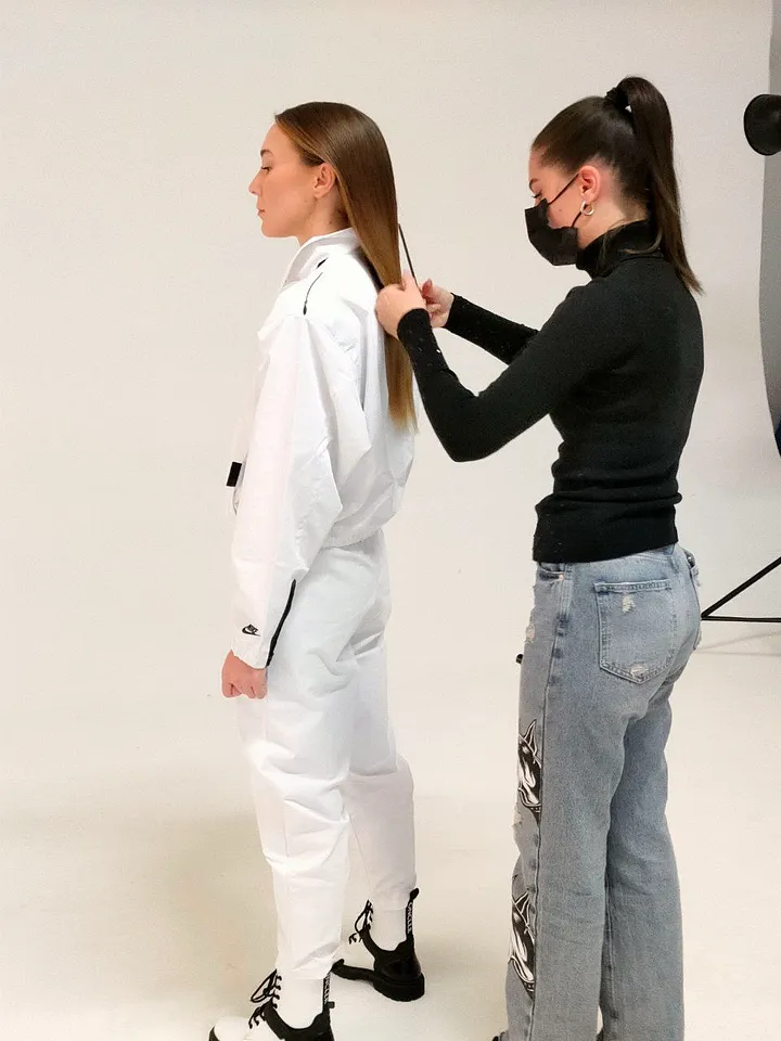
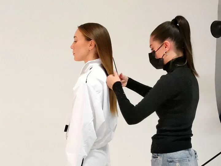
8 december. Shooting time! I gather the entire agency team where we will shoot the photographs.
Boomer alert: for the first time I really feel like the CEO of a marketing agency. I self-slap myself hard: feet back on the ground, Romanin. You are a web developer. You may have thought of the concept of the model mirroring herself into technology with Francesco, sure, but breathe back slowly. You’re a developer.
The shooting turns out to be big fun, the model and the MUA are really good, and Francesco also does his utmost to create light painting experiments (available in NFT for those who might be interested). Within a few hours Francesco sends me the pictures. My wife sees me smiling for the first time since our wedding.
We do the tests, I’m happy: launch is confirmed on December 15th.
It is Friday 10 December when Francesco writes to me “listen, but is it ok that the videos are not working on iPhone?”.

We haven’t done enough debugging. No, to be honest; we hadn’t really tried it on the iPhone once until then. Madness. A thousand nightmares crowd my round head: it is very likely that the whole video system that we have concocted in recent months may not work on the iPhone, which has much tighter security policies on the topic. A whole site suddenly mute on iPhone. “This site looks better on mobile, BUT NOT ON IPHONE”.
Well yes, it seems to me an excellent business card for international agencies.
I spend a weekend ruminating and grumbling: on Monday morning at the kickoff Matteo just says “ouch!”. And I cry bitter tears. After an hour he writes on Slack: he punched the site like Fonzie and now it works flawlessly on iPhone too.
“YA DON’T SAY?” I say, quoting Steve Jobs.
For real, yes. We even find the time to implement dark mode at the last minute, and to spend two days of development on Lighthouse and nginx to improve its performance until it works fine on a Alcatel phone built in 1918.
After the publication, when I get the first compliments, the first offers of microcorrection to the furlan texts, and everything starts to work, I look for a moment at the mountain of work we have climbed, with all the beautiful people who have helped us and contributed to the project (hello Beatrice Peterchiutto, Manuel Maggio, Andrea Zini, the boys from Mabiloft and Belka, the always magical Nama). Maybe we won’t win no award, yet the feeling of having built something outside the box is there, and I can only be grateful to everyone. It’s a newer, truer picture of what we have become and what we want to become. From here, finally, I see the future I want.

